Reports is a powerful feature of Eclipse Pro allowing users to view their performance in a customisable way. The reports page allows the user to customise what data is shown, what date range to look across and what metric to measure.
The reports page is split into the following sections:
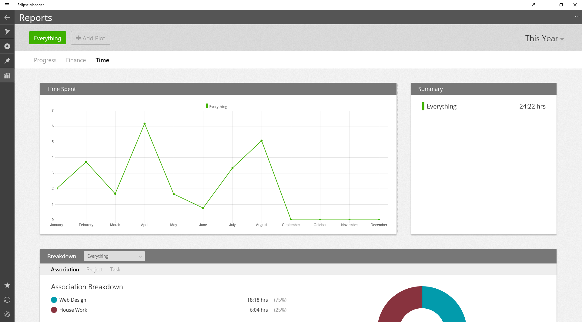
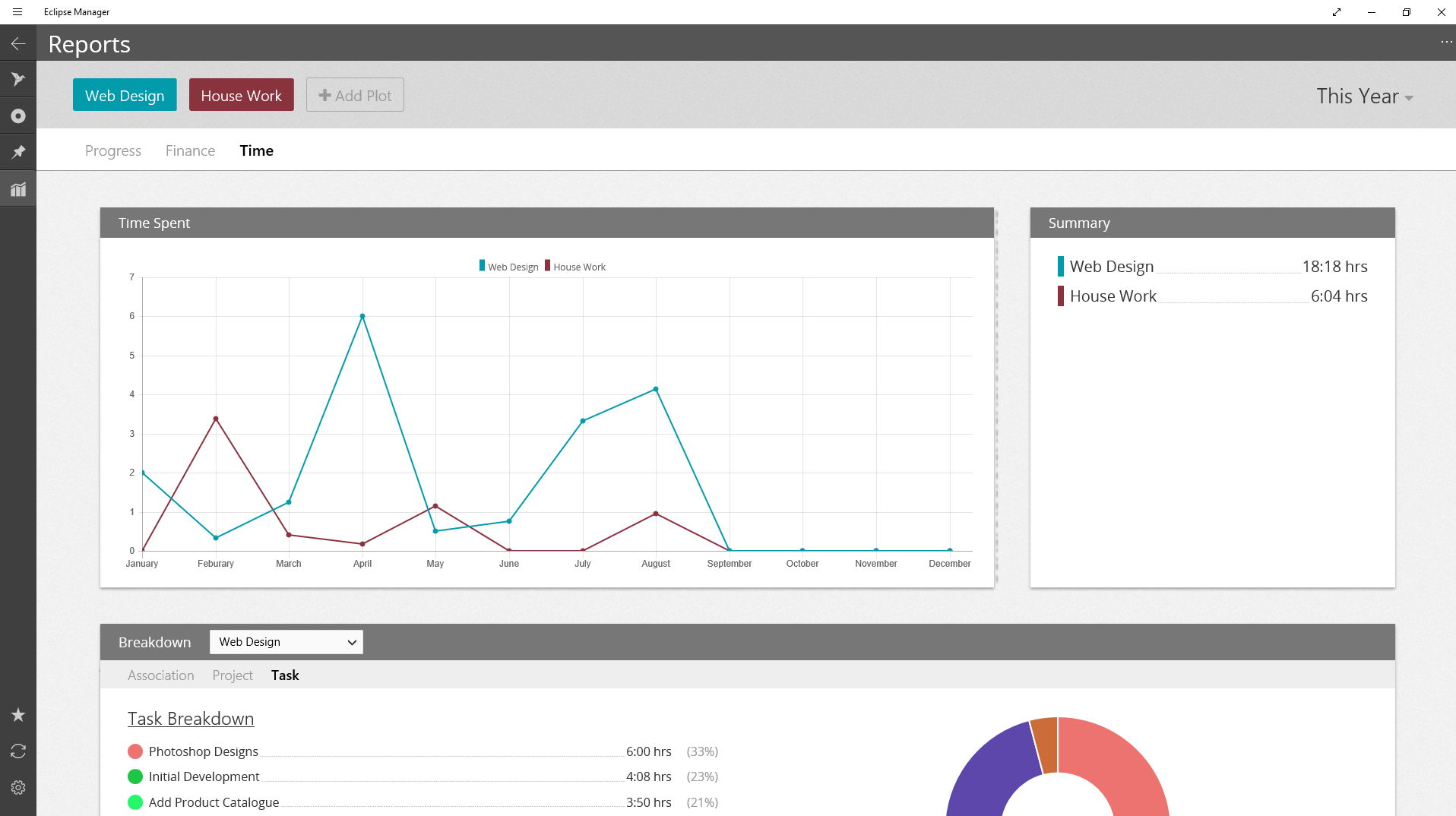
The graph plots the values on the Y axis against the time on the X axis.
Next to the graph the summary section shows the totals for each plot.
For a given plot defined in the dropdown, this section lets you explore the plot to see how exactly the data has been made up.
The reports page can show multiple datasets simultaneously, each dataset is called a “plot”. To add a plot, click “Add Plot” at the top of the page. Currently plots can only be filtered by Association, select the Association you want to add as a plot, or select “All” to plot everything. This will add the plot to the top of the screen, simply click on it to remove it.
The Reports page has three views: Progress, Finance and Time. To swap between them simply click the view you want at the top of the page.
The Progress view shows tasks that have been completed.
The Finance view shows you how much invoicing you have achieved.
The Time view shows how much time you have invested.
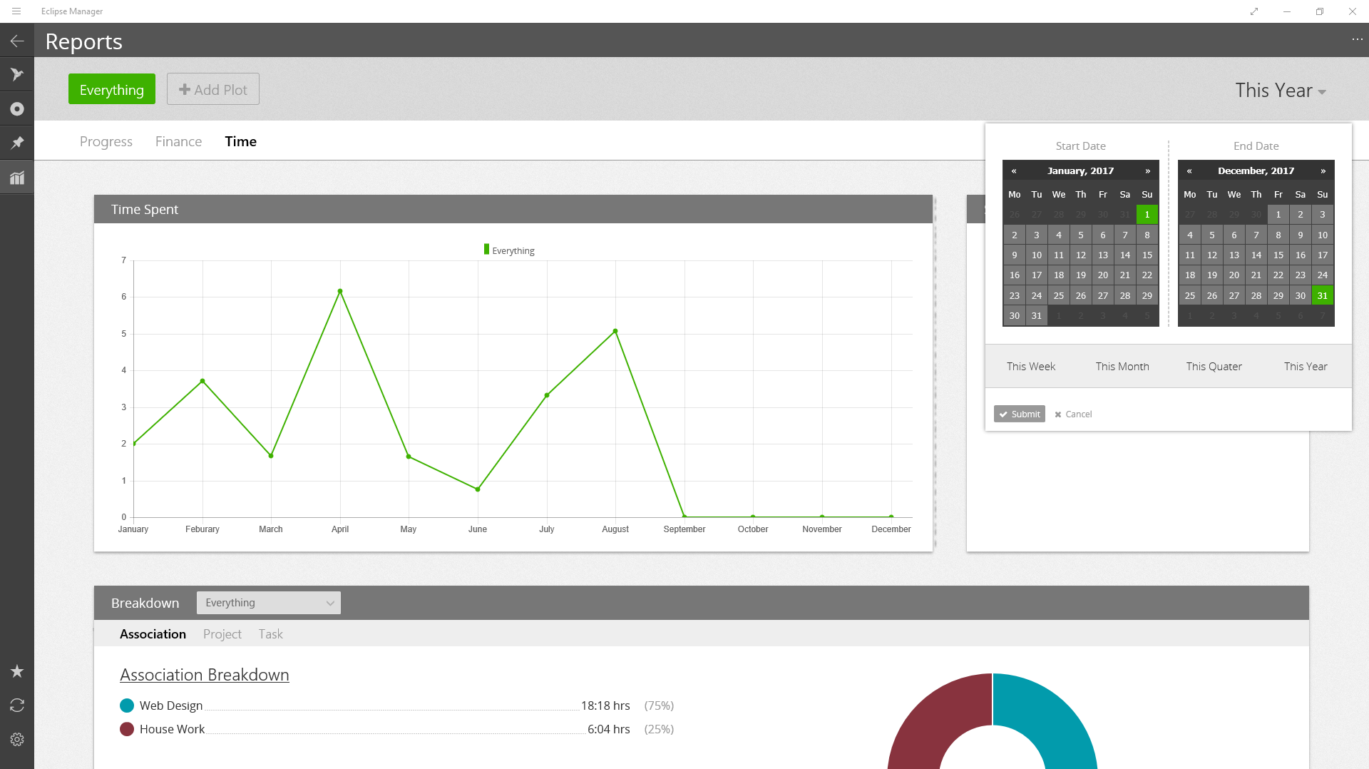
The top right hand shows the current date range. This can be changed by clicking on it to bring up the date picker. Select a start and end date and click "submit" to apply it.